36 Days of Type is a project that invites designers, illustrators and graphic artists to express their particular interpretation of the letters and numbers of our alphabet.
A 36 day open call of restless creativity, where participants are challenged to design a letter or number for each day, showing the outcome of the ability to represent the same symbols simultaneously and from thousands different perspectives.
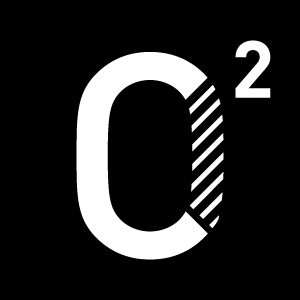
Every year I try to do something different and this year was about going back to basics. Nothing fancy, just focusing on creating a good looking, chunky, serif typeface.
This year’s 36 day challenge focused creating a consistent typeface style, with high contrast between thick and thin.
36 Days of Type is a project that invites designers, illustrators and graphic artists to express their particular interpretation of the letters and numbers of our alphabet.
A 36 day open call of restless creativity, where participants are challenged to design a letter or number for each day, showing the outcome of the ability to represent the same symbols simultaneously and from thousands different perspectives.
Every year I try to do something different and this year was about going back to basics. Nothing fancy, just focusing on creating a good looking, chunky, serif typeface.
This year’s 36 day challenge focused creating a consistent typeface style, with high contrast between thick and thin.


